


When Robert Allen (sex pest) published the worst formatted book of all time
It's just that bad!


In 2018 I bought a copy of Robert Allen’s Ricky Ricardo Suites for fifty cents over at The Word, before I'd heard the stories about Allen (and probably why it was getting tossed for half a buck), a poet who I had, as a freshman, come to admire in his collection Standing Wave after hearing excerpts at a reading. Didja really do it, Allen? You dead bastard? I have people in my life whom I trust, both former students and current professors in the Concordia CW program, who have said that, yes, he most certainly did, and then some. I suppose it doesn't really matter now that his ass is maggot food. Also Ricky Ricardo Suites sucks the bag.
Again: it was fifty cents. The book's formatting is already a travesty. It's only a meager 82 pages but is wide as a duck, awkward to hold, possesses an awkwardly-rigid card back. All of this is to say nothing of the cover, which might be one of the ugliest pieces of shit I have ever seen. Can we get a closeup?

Jesus Christ, this monstrosity looks like its right out of Microsoft Paint. A complete lack of compositional thought, utilizing the sort of font I'd expect to see on the menu at a shitty diner. It's a cursive font, but the spacing between letters has been increased enough so that none of the letters actually connect—they're just these awkwardly detached cursive letters. How did you fuck that up that badly? And the colour-scheme, wowza. I know a good cover ought to pop, but bright fluorescent orange and green? Really? This has to be a joke, right? Was Robert Allen colourblind or something? The copyright information informs me that this cover was designed by a press which is explicitly not the press who actually published this pressing, but they went ahead and used it anyway. So what gives?? Was one press trying to pull a prank on the other, and this book was the result?? Maybe I can try my hand at a quick fix.

There we go.
The title fonts inside the book don't match the cover but still aren't much better. Instead they're this similarly stock-looking and very oddly-weighted font, sorta Fjalla-One-esque, that looks particularly terrible when italicized, and so it is of course italicized constantly. And listen: I hate to be a stickler, but it's a sans-serif display font, and all the poetry is written out in Times New Roman, which is a serif text font, and that’s not to say that that never works but it just clashes really bad and... I just... I don't understand. Why? Why any of this? Who was the design team on this? Why does Robert Allen's author photo at the back take up more than half the page?
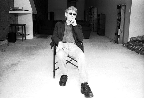
Why is it so big it bleeds out of the margins, and why is it taken from so far away? Could you not have cropped this? He's sitting in a painfully under-furnished loft, wearing the ugliest boots I have ever seen (I shouldn't even be able to see his shitty fucking boots), with soles thicker than you'd believe, and the photographer is credited with a watermark in the corner in spite of the fact that he's already been credited in the copyright. And Allen, all the while, staring off into the middle-distance like a complete jackass, like he's Martin fucking Amis, all with his douchebag rimless sunglasses on. Indoors. At what appears to be evening.
Even his bio feels oddly off to me. Check this out:
British born and raised in England, Canada, and the United States… Robert Allen is the editor of Matrix and for many years served as the director of the Concordia creative writing program.
What is with that unnecessary and boring geographical-biographical note? Why is he presented like he's a viking? Why did they stop short of telling us his lineage? “British born”? You mean “born in Britain”? “British born” sounds like a race in the Forgotten Realms. Is “director of the Concordia creative writing program” a translation of an Old Norse kenning meaning “ephebophile”?
I haven't even gotten started on the fucking poetry! Have I got the time? It's fucking bad! It's supremely-indulgent shit! Ironically, it begins with an account of Al Purdy sexually-harassing Allen's girlfriend at a party.1 After quickly lambasting the recently-deceased Purdy for his misogyny, Allen goes on to write pages and pages of (ironic?) misogynistic poetry. When he isn't writing boring poetry about the sexual liaisons of Marilyn Monroe (a well-read and not-unintelligent and sensitive soul who wrote poetry, deeply enjoyed Ulysses, and was married to one of the foremost playwrights of his generation), he's juxtaposing Britney Spears’ “empty-headedness” with his “ability to quote Yeats and Baudelaire.” The book is also filled with ostentatious, awkward references to the Pogues (“I lit a cigarette and played the Pogues' *Fairy Tale / of New York.”), Homer Simpson (“To alcohol — the cause of / and solution to all of life's problems”), condescending remarks about hip hop music (“downstairs it's bitches and ho's”), as well as multiple references to Allen's extensive vinyl collection. This all amounts to one terrible embarrassment. Allen, at his nadir, is desperately trying to prove something—to himself, to the world, to you the reader, and both to and through young women.
Someone should have bought Allen a mid-life-crisis convertible. I guess instead someone got him a hearse. Oh well! Sometimes you just have to shit out a chapbook designed by Benito Mussolini, and that's just all there is to it! Someone should have slapped Allen with a restraining order, but instead he just got a death certificate. For the money I spent on this? I could put a quarter over each of his eyes.
[This blog post is adapted from Jack Daniel Christie’s review of Ricky Ricardo Suites on GoodReads]
It also called to mind Purdy's infamous meeting with Magaret Atwood, wherein Atwood ended the conversation by giving Purdy a well-deserved shower in her beverage. Wonder why?